Thursday, 28 November 2013

Drafting

Front cover drafts:


I am happy with the font I have chosen for my first draft as believe it relates well to the pop genre because is fun and bubbly. I am not sure about the placement of the snowflakes as I think it makes the cover look to messy. However I do want to incorporate the snowflakes somewhere on my cover to link to the season of December.


Here I added in a borderline to make the cover look more professional by highlighting the main features of the article and making them stand out. Also I added in a top UK 40 cover-line, although I do think this will be a good feature to involve in my magazine I don't believe it looks right on the page.


I switched the last cover-line to make the front cover look more professional however still link it into music. I deleted some of the snow flakes and only left one because I believe that the snow flakes took attention away from the masthead. In despite of this, I still kept one to reinforce the season that the magazine is issued in. I also added in a puff and plug for a competition. I put it in a blue box to go with the colour theme and also make the text stand out more. I added a drop shadow effect to this puff and plug to make the magazine look more 3D. I also added in a barcode to give the magazine a more authentic feel.


Here i added in my main image of my model and made her centre on my cover so that she is the main focus. I kept my puff and plug however moved it to the stop of the page and shortened the writing in it to make it more memorable and easy to read. In the yellow box's I put in key words to make the readers want to read on. Yellow is a bright colour and attracts well to the eye. On the yellow box's I added a drop shadow to add empathises. I also added in another cover line, which is based on celebrity's because in pop magazines they are usually about gossip and pop stars. I also added in a tag line at the top 'THE UK'S NO1 MAGAZINE FOR CULTURE' to make the magazine look like the best.


In this draft I have changed my cover image because I was able to use my original photo anymore. I also added in another cover line 'This seasons fashion MUSTS' to give the front cover more content. Also I added in a pull quote from the double page spread.


In this draft I have changed a lot. I have changed the mast head font to a more bold text to make it stand out more. I also put a yellow box under most of the content to make it stand out more as yellow on pink makes the words more bold. I deleted the box that went under 'LOOK! its SHAUNA' and changed it to just 'SHAUNA' because then it doesn't block the image behind it and also I believe looks more professional without. I have added in a white circle box for images of clothes to go in there with the cover line 'DRESS LIKE LITTLE MIX!'. I have also added in a picture of the x factor logo by the cover line relating to x factor as gives the front cover more depth and a visual stimulus.


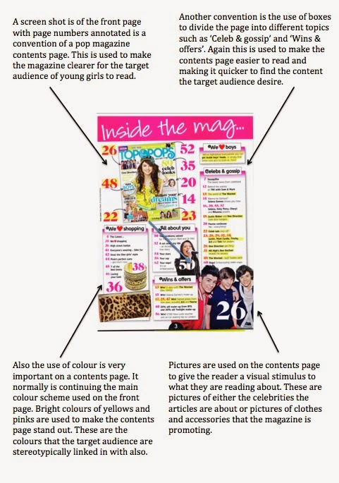
Contents page drafts:


I have added in the mast head 'contents' in the same font as the masthead on the front page. I have added in pink lips to empathises the fact that its a girls magazine. I also constructed a box with the title "MAKE IT... GOSSIP" which my page numbers and a brief summary of their content will go.


Here I have put in the page numbers with a brief summary of the content next to them. I have also put in a little box with 'Ssh! Secrets' in it to make the reader believe their getting exclusive gossip. In the corner I have put in a circle shape with the cover line 'MAKE IT... FASHION' and I intend to put in pictures of fashionable clothes with boxes saying which famous celebrity wears them.


Here I have added in photographs at the bottom of the celebrity that appears on the front cover. I have also centralised the lips to balance out the page and to stop it blocking important content. I also added in 'MAKE IT...' before contents to reinforce the masthead of the magazine and continue the theme. I added in a screenshot of the front cover with numbers annotated around it to make the pages more simple for the reader to find. Another box has been made 'MAKE IT... COMPETITION' to make the competition stand out more. I have also added in quotes of celebrities around the page to give the reader a sneak peak of is what to come.


I have added in a blue box behind most of the content to add some more colour to my contents page as there was too much white. It also gives the page more of a dimension instead of it looking flat. Here I have played around with using 'INSIDE THIS MAG' instead of 'CONTENTS' but I believe that 'CONTENTS' looks better and goes better with the 'MAKE IT...' theme.


Here I have changed the font of 'MAKE IT... CONTENTS' to make it stand out more and be the first thing the reader sees. Also I have changed the font to link it to the font of the front cover, which will make the magazine look more consistent and therefore professional.

Double page spread drafts:


This is my first draft of my double page spread. I constructed an interview and added in pink circles behind the writing to make it stand out. I wrote 'cover story' as the title which I believe didn't make the text seem interesting. Also I added a picture of Shauna on the other page however it made the page look to plain and also the picture had a yellow wash to it. I believe my first draft looks really flat and needs some dimension to it.


In this draft i have changed a lot. Firstly, I have made the interview smaller so I could have a bigger and more eye catching title. My title is a pull quote which I believe with interest the reader to carry on reading. In the interview I have highlighted key quotes which I believe the audience will be most interested in. I have added in a page number and the magazines website in the corner at the bottom just to make the magazine look more authentic. I have made 'COVER STORY' a lot smaller but kept it so the audience knows that this is the main story of the magazine. I have changed the photograph of Shauna to a one of her pulling a silly face to allow the audience to feel like they are getting a different and more fun side to her. Also I used photoshop to back the background more white instead of having a yellow stint to it, which I believe makes the photograph look more professional. 


Monday, 25 November 2013

Planning For Main Task

Initial Ideas:


Proposal:

I am going to be aiming my music magazine at young girls from 11-17; I am aiming my magazine at this type of audience because stereotypically that age range of girls are the most interested and involved with that genre of music. Also conventions of the genre is pinks and purples which are mostly associated with being girly colours so thats what I chose this target audience.

For my main image on the front cover I would like to have a close up photo of either an attractive male that the target audience with fancy or a photo of a pretty female who is an excellent role model so that the target audience can look up too her. I will make sure the in the photo of the model they will be smiling to indicate that it is a fun and carefree magazine like the genre of music. Also I will make sure the model is wearing bright coloured clothes so that they fit in with the fun theme. To get this image I will get a plain yet effective background and ask the model to stand in front of it and smile. I will then get a close up shot because it is a convention of a pop magazine.

My magazine will generally be about everything pop. It will include features about pop artists, pop music and pop gossip. A convention of a pop magazine is to have gossip about pop celebrities in them because that is what the audience want to read about. I will also include tour dates of some of the pop celebrities for the slightly older end of our target audience. Finally I will include features about pop celebrity fashion and what they are thinking is 'hot' or 'not' right now; the target audience will enjoy that they are taking direct fashion tips from the celebrities who always look good.

Typical cover lines will include stories about the celebrities, from interviews to gossip. I will also include like I mentioned earlier stories about fashion tips and cosmetics for the slightly older girls. Also I would like to include tour dates for some of the celebrities. Another thing I will include is free posters of attractive celebrities so that the audience believe they are getting more for there money. A final idea of mine is to include stories linked in to the season for example for december I will include stories about  X Factor ( as is on near Christmas ) and include winter event dates like 'Jingle bell ball' and 'Winter Wonderland'.

The masthead I have decided on is 'Make it pop'. I like this masthead because I believe is a easy to remember, catchy and includes the genre of music. 'Pop' in this masthead means two things; first of all it means the genre of music so that the target audience know what they are going to be getting inside the magazine. Secondly it is a onomatopoetic word, 'pop' is a sound and therefore links to that fact that the magazine is about music and sounds. 'Make it' in the title is an imperative and therefore tells the reader what to do. The target audience will believe that they are being directly spoken to and will want to read on. Other titles I came up with was 'Pop mania' and 'Pop world', I did like this names however I believe that they where to similar to some other iconic pop magazines titles.

I am going to use the font 'serif' because it is traditionally used in magazines and therefore will give my magazine an authentic and professional look. The font 'serif' is also linked to looking like a girly font because is curly; this will link in effectively because my target audience are girls. Also for some of the more important words on the front cover I may use a different more bubbly font to grab the target audiences attention more and make them focus on the good parts of the magazine.

My magazine is going to issued weekly. This is because music news is always expanding and if it was issued monthly there would be to much news to fit into the magazine. Teenage girls will get bored reading the same magazine for a month because the content will be the same, so if it is out weekly they can read more recent music news. I will still link the seasons to the weekly magazine for example for all of the December magazines I will make a reference to winter and Christmas in it.

The dimensions of my magazine will be the typical A4 size. This is because most magazine are traditionally A4 so will look more professional. It also gives a lot of room to add more content and to make the font a bit bigger so it is clearer for the younger audience to read.

I will make the price for the magazine £1/1.50 because it is aimed at young teenage girls who won't have a lot of money to buy more expensive magazines. The target audience will most probably not have jobs and just be getting a basic amount of pocket money so making the magazine around £1 will it affordable for them to buy.

On my contents page I will have colours that link to the front cover to create a ongoing theme of colours, which will make the magazine overall seem more professional. Also on the contents page I will add pictures that link to the brief summary of the cover lines so that the target audience can visually see what or who the cover line is going to be about and not have to read it all.

Monday, 18 November 2013

Music Magazine Research

Here is a prezi I made which explores the different types of music genres and there conventions. This research helped me to decide what genre I believe is best for my magazine:


I also constructed a questionnaire about music magazines that I will ask a mixture of students to answer. I will ask 50 students this Questionnaire. The questions I asked are:

1. Have you ever read a music magazine?
    Yes                  No
2. What is your favourite genre of music?
     Pop                Rock             Indie           House
3. What is the most you would pay for a music magazine?
Under £1             £1                       £2                  £3 or over
4. What is your favourite genre of magazine?
     Gossip          Music           Sports              Fashion

The results are as followed:

Question 1-


Question 2-


Question 3-


Question 4-


To conclude the results show the clearly the most popular genre of music is pop and the most popular genre of magazine is gossip. A convention of a pop magazine is having gossip pages in there. I believe that I should choose to create a pop magazine because according to research is the most popular and therefore will get sold the most. I will charge my magazine at around £1-£2 because that is what the majority said they would pay for  a magazine and I want to keep it affordable for the target audience.


Analyses of a typical pop magazine contents page:


Analyses of a typical pop magazine interview page: